This publication will focus on my final jury from Arts School (at ENSAV La Cambre, in Brussels): what was presented and discussed; what worked and what didn't; and how the four projects/propositions presented evolved since June.
“Your trash my treasure”
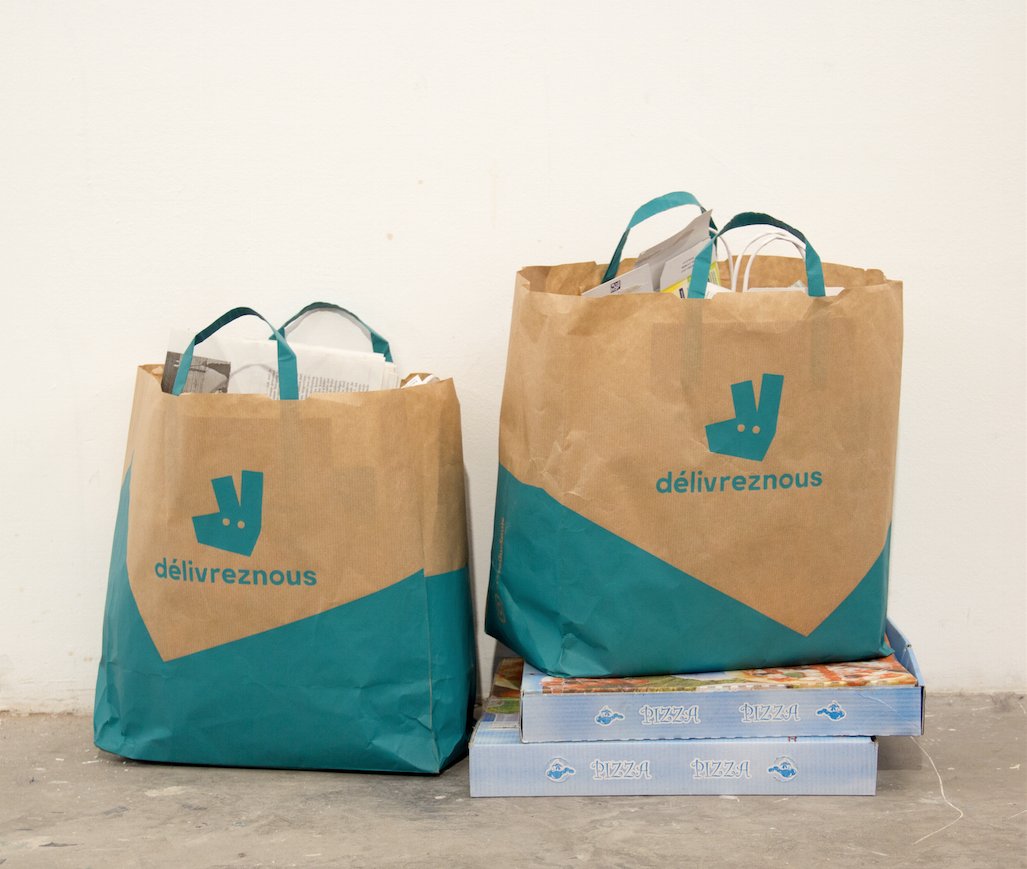
My first project was about Deliveroo, the UK-based online platform for food delivery, and focused on its delivery people’s labor conditions. For the show, I exhibited silkscreen printed Deliveroo's paper bags, with a barely visible twist in the original brand name: Deliveroo became 'Délivrez-nous', from the French for 'set us free' or 'rescue us'. The direct and imperative tone of the phrase suggests a state of emergency and distress, a call for help like an S.O.S. Relatedly, I called this project #SaveOurSouls as it evokes the Christian prayer to be freed from evil, symbolized here by hyper-consumerism and gig-economy. As the idea of the twist in the brand name came to me during global lockdown, the ambiguous and polysemous phrase could be interpreted as something said either by the ones who ordered the food online—who, confined by law, felt deprived of their freedom of movement—or by the gig-workers (in this case, the delivery person) doing underpaid, unsafe jobs. In the show, the pastiches of food delivery paper bags were filled with trash that I collected in my neighborhood, and showcased on top of empty pizza boxes, also coming from the streets.
From the 20 silkscreen Délivrez-nous bags, I left half in the streets as if actual trash. In hindsight, I regret throwing them away, having taken so much time to making and assembling them! However, I felt like it made sense to contextualize the artifact in places where I, and anyone else, would usually see them (their ‘natural’ and ‘original’ environment/context). By doing so, I hoped to challenge people's perception and to communicate with citizens and street cleaners, for what otherwise appeared, at first glance, as trash or visual pollution.
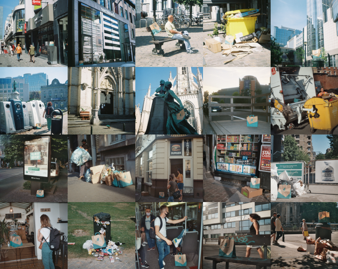
Contextualization of 20 silkscreen printed food delivery paper bags, on which one could read “Délivreznous”
(Brussels, June 2020)
(Brussels, June 2020)
Another part of the project included a living sculpture: for 2.5h, on the Avenue Louise (a wealthy commercial avenue in Brussels), an actor wearing the twisted Délivrez-nous uniform and holding a delivery backpack pretended to wait for someone to pick up their food. The location, being such a busy shopping street, was moreover strategic and offered a situationist dimension to the performance/action: it recreated the ordinary situation of delivery people waiting outside for the food to be prepared or picked up. A moment of vacuity, of void and of activity suspension. The reenactment of the banal situation was thus the spectacle of delivery people’s dependency, alienation and temporary deprivation of freedom.
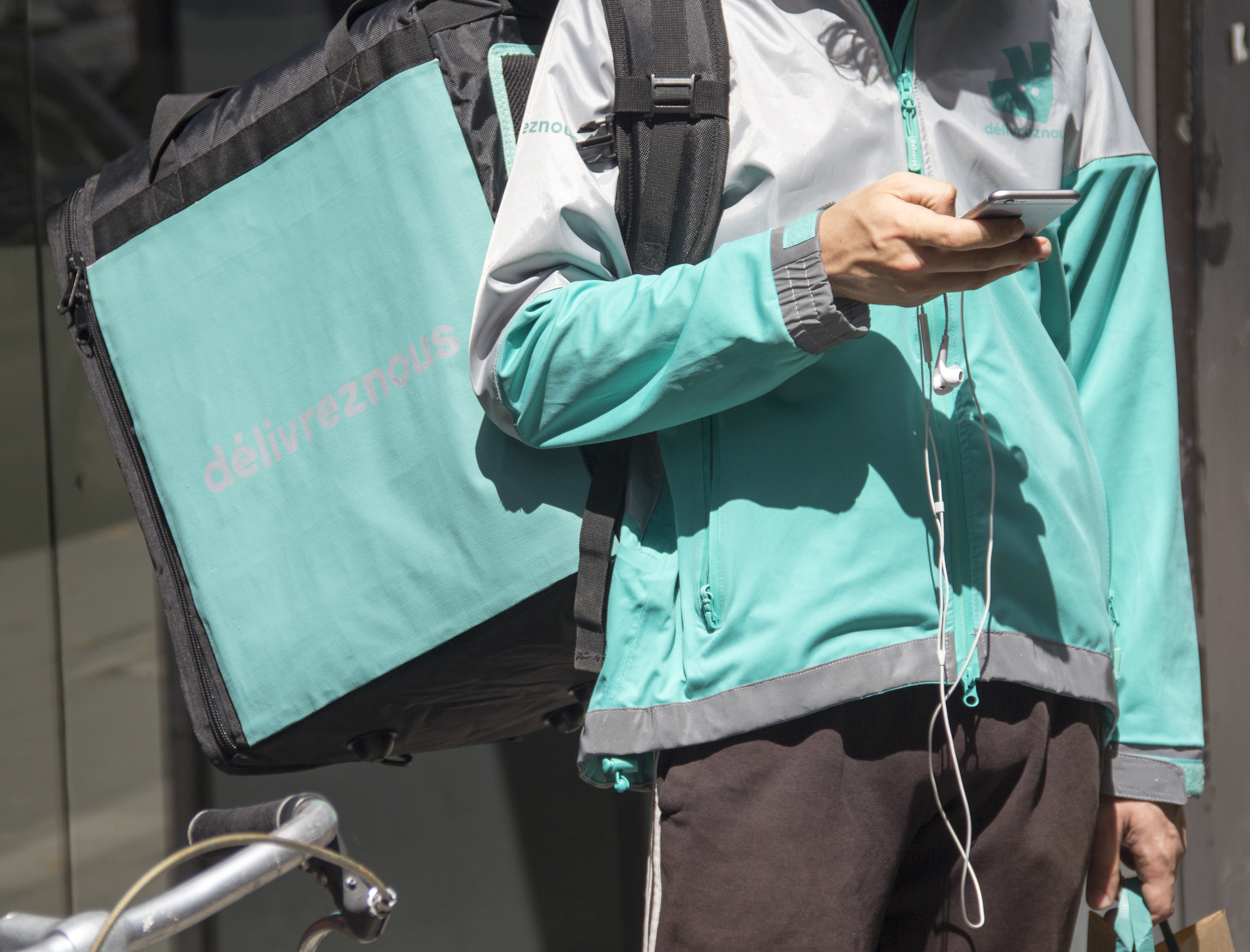
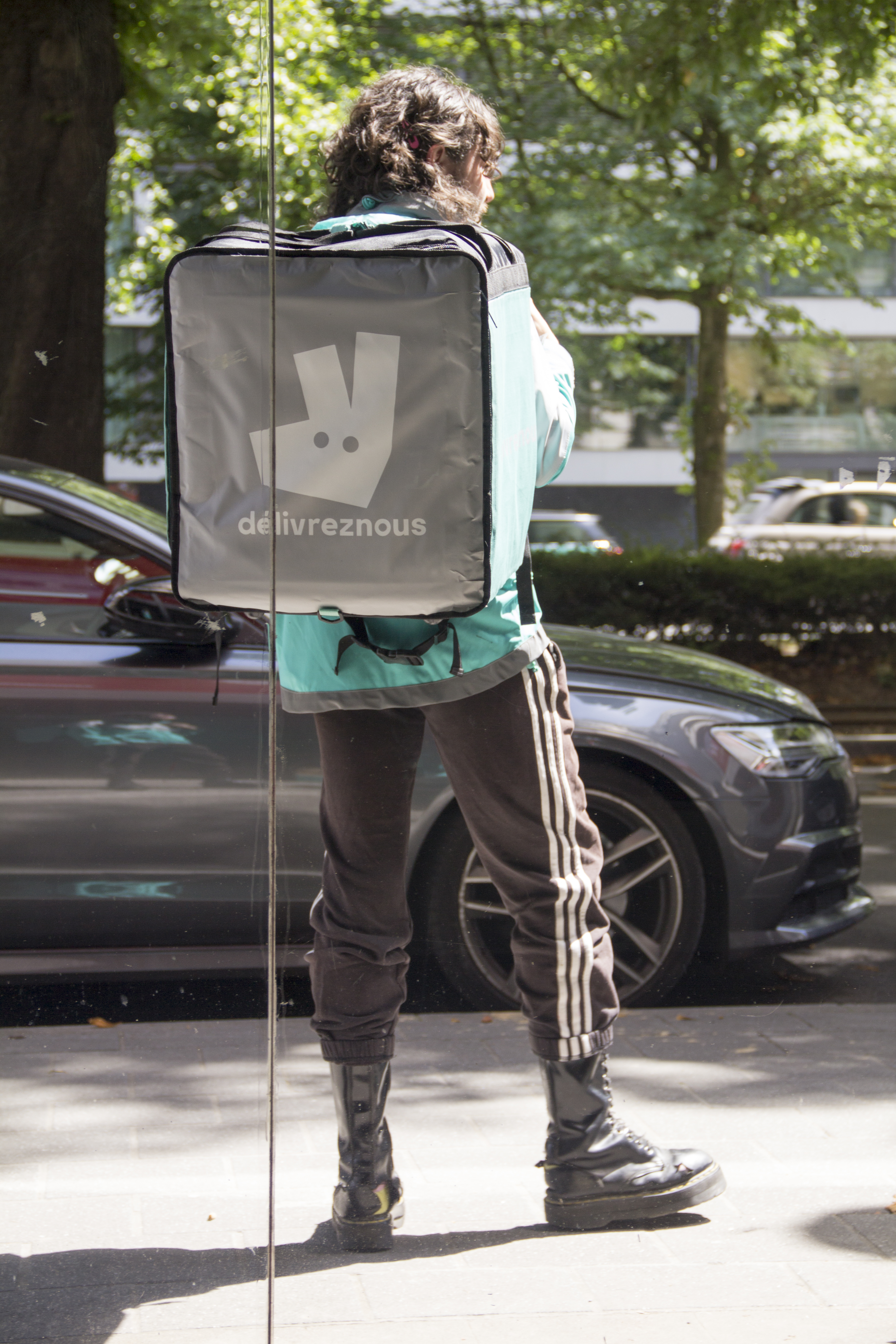
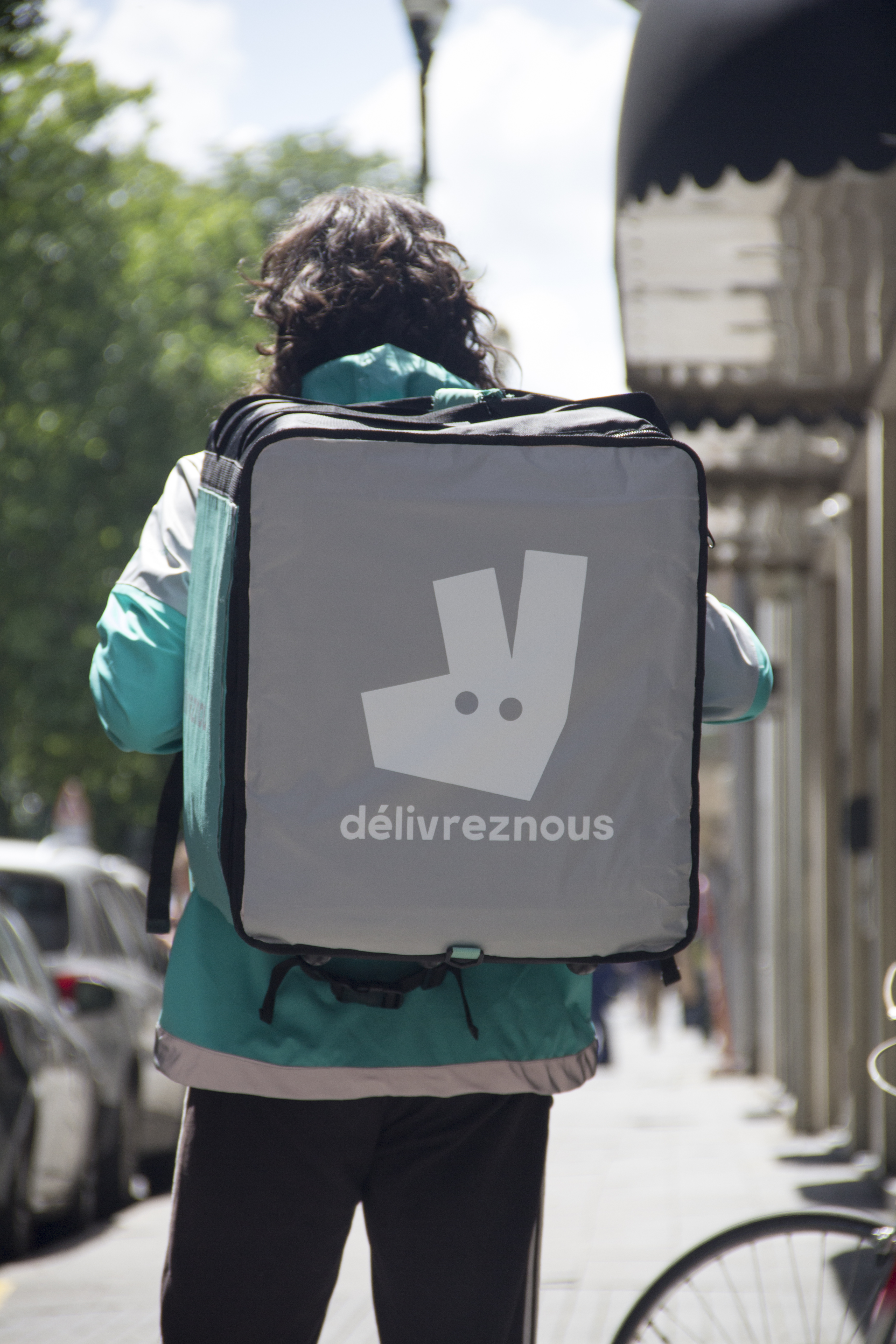
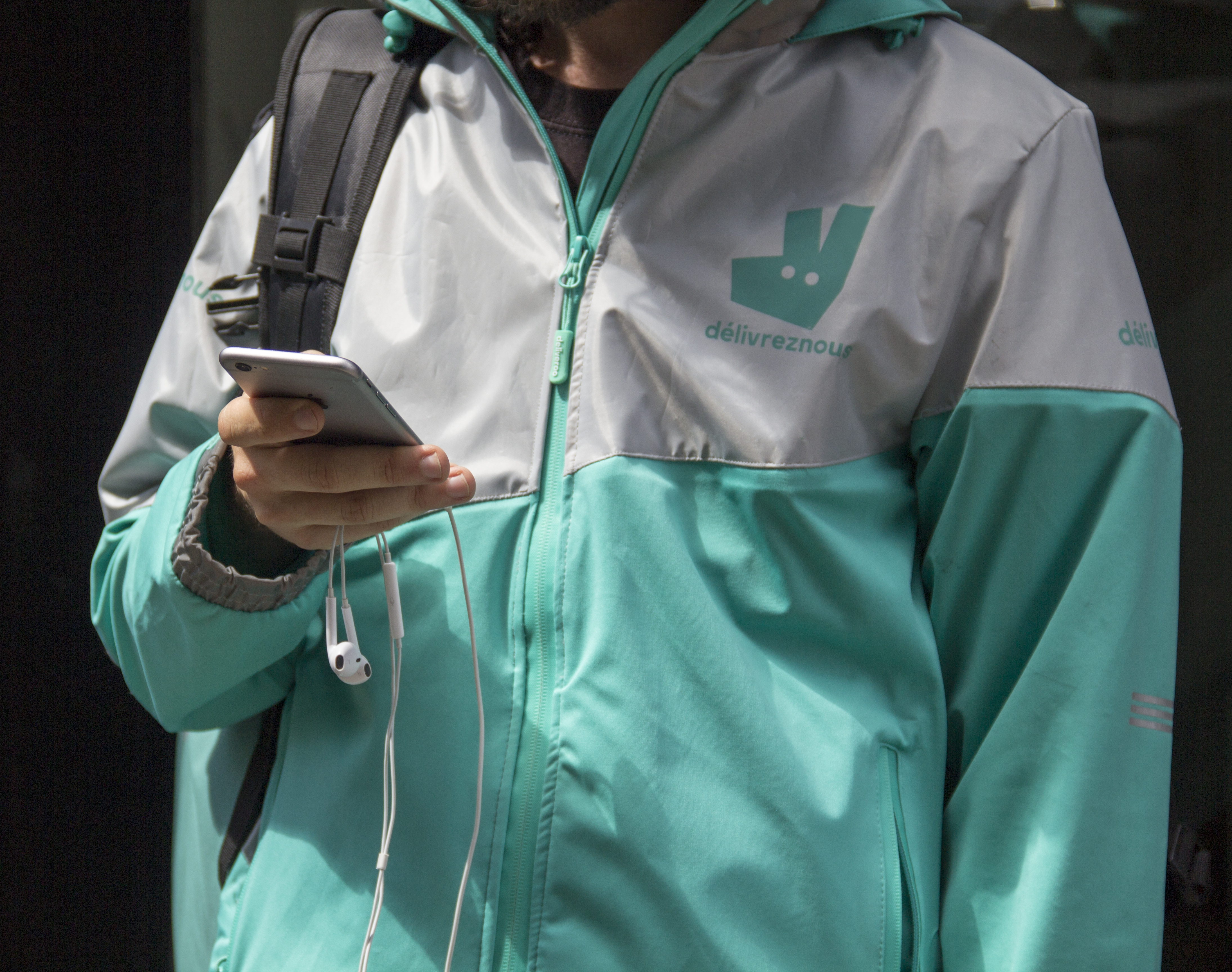
#SaveOurSoul, 2020
Action/Living Sculpture
in situ (Avenue Louise, Brussels)
Action/Living Sculpture
in situ (Avenue Louise, Brussels)
Later this summer, I’m planning to make another performance/action in public space that will consist in infiltrating the Deliveroo platform by delivering food to customers, wearing the twisted uniform and handing them food in the twisted paper bags. I’m still thinking of technical details—how I want the final video to look like and where to film. I want the video to be dynamic and sophisticated (a drone would be so much fun), but still simple and low budget. Francis Alys's videos in Mexico City, for instance, highly inspire me.
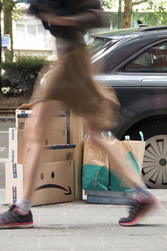
The second project I presented the jury was about Amazon, which also profited from the intensive activity emanating from the global lockdown. Just as I had noticed the increasing amount of Deliveroo, Takeaway and Uber Eats paper bags, I witnessed innumerable Amazon cardboard parcels in the streets on trash collection days (fun fact: I was told that Belgium receives approximately 130,000 Amazon parcels to distribute—per day!). I therefore decided to collect the clean cardboards that my neighbors were throwing away. I took them home and started painting sad emoticons on them using the Amazon arrow logo turned upside down. I also added a pun on the adhesive tape that closes the box: where Prime became 'déprime', from the French for ‘depression’, thereby evoking my own feeling of desolation at marketing strategy for intense consumerism and abuses of the capitalist system.
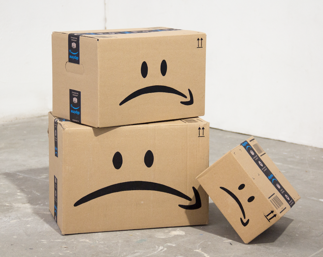
Sad, Anonymous Parcels, 2020
Mixed media
I wanted to paint as many boxes as possible, so I could exhibit them in the streets, among other trash (like I had done with the silkscreen Délivrez-nous paper bags) but also to sell them online. I’m also thinking of a way to activate and exhibit the unhappy Amazon parcels by dressing up as a postman and walking through the city struggling to carry a huge pile of unhappy Amazon shipping boxes. Unfortunately, I still have to find the uniform! I've asked postmen and women in the streets and even tried to apply for a postman job during summer vacations in order to infiltrate the postal services, but the process ended up being too cumbersome and unlikely to succeed. Ultimately, I may just have to sew up my own—stay tuned! As for the Deliveroo project, by wearing the uniform and activating my artisanal artifacts, I wanted to put myself in the shoes of essential workers and get a glimpse at what their daily lives look like. I want to play: both with my own identity and people’s perception in the city streets.
Now we move on to the third jury project which was about the FIFA World Cup edition of 2022, taking place in Doha, Qatar. I started conceiving this installation back when I was still in Beirut, after I saw a light projection on El Raouche (one of the national emblems and a touristic attraction in Beirut) that advertised the mega sport event. As I stood there, I wish I had the means to put together my own light projection near the bay: a projection that would appropriate the 2022 World Cup visual design and subvert it in order to expose the labor conditions on Qatari stadium worksites, where approximately 1,300 migrant workers from Bangladesh and Nepal, among others, had already died.
I was also outraged by the absurdity of hosting the World Cup in a desert, which would put athletes at risk and thus require that stadiums be equipped with huge, polluting, air-conditioning systems, all of that for sensationalist spectacles that cultivate nationalist, racist and macho ideologies worldwide and that are sponsored by the most unethical and unhealthiest multinationals.
For my show, I therefore decided to use the black box room to exhibit an ice-replica of the FIFA World Cup trophy inside a mini-fridge. Next to the ice sculpture, a screen projection showed the 2022 FIFA World Cup design, with the following pun: "FROZEN WORLD CUP, QANAR 2022"—where Qanar refers to the French 'un froid de canard' or ‘freezing cold’. Those visual and lexical reminders of the cold (the iced-trophy inside the fridge, the snowflakes, the shades of blue instead of red) were meant to draw the attention to the air conditioning systems being installed in the new Qatari stadiums.
I projected a video of an animation I had made in Beirut to parody FIFA's advertising campaign by simulating a 3D mapping video on El Raouche with snowflakes, Nepali passports and rhododendron falling down. As the video played, an epic and sensationalist soundtrack was played in synchronization with the animation.
If I were to do it again in a European City, I probably would remove the reference to El Raouche, as people might not recognize the Lebanese symbol, and remove the wordplay on Qatar, but I would keep the symbolic snowflakes, passports and flowers animation, as well as the shade of blue and incrusted snowflakes of the 2022 logo design. I like the screensaver aesthetic of this parody of advertising campaign for 2022 world cup. Lastly, I should make another silicon molding of the FIFA Trophy (which should be 3-D Print to respect original dimensions. The one I did was in clay and became smaller while drying...
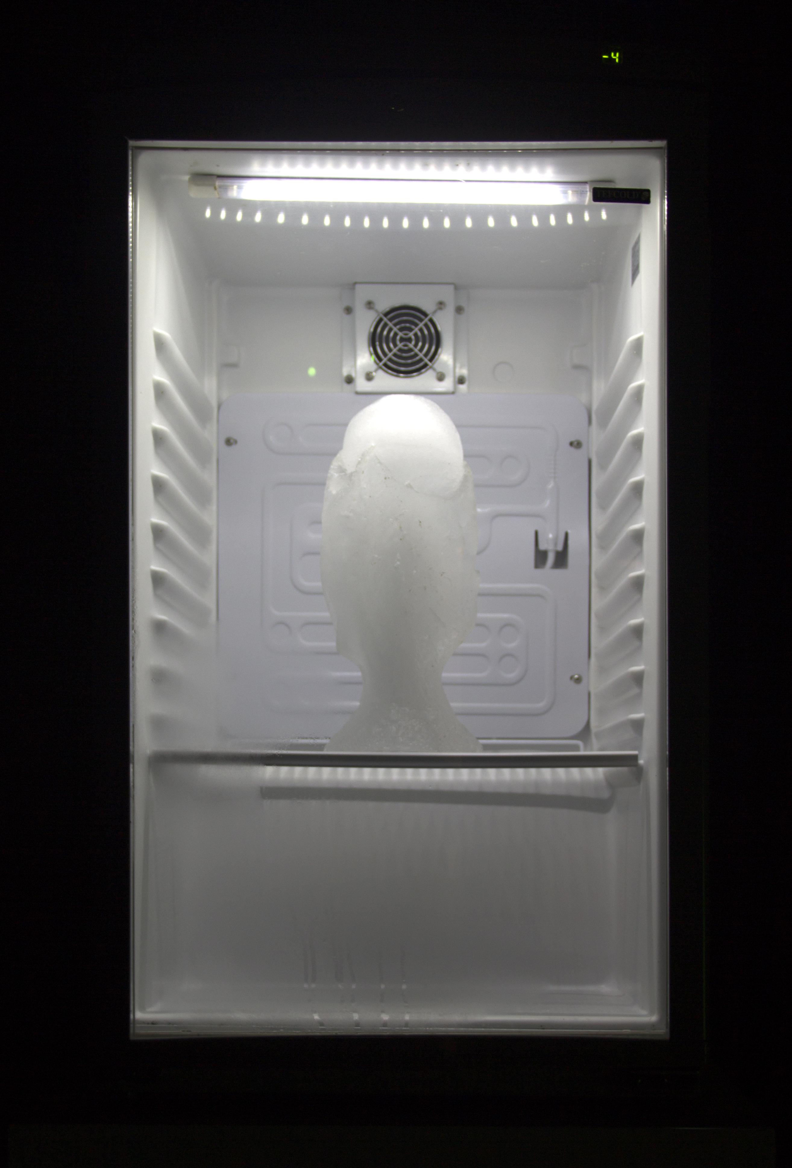
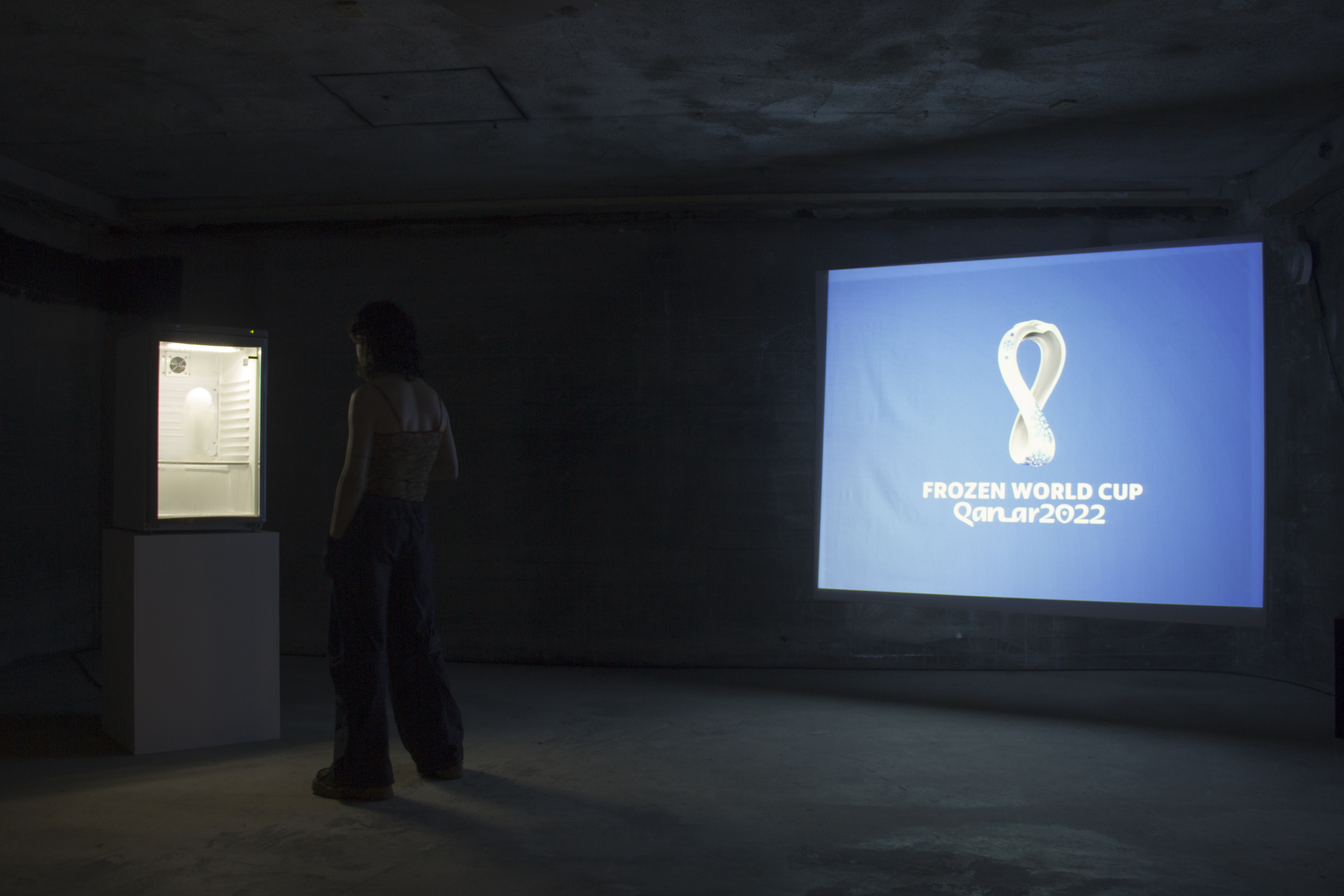
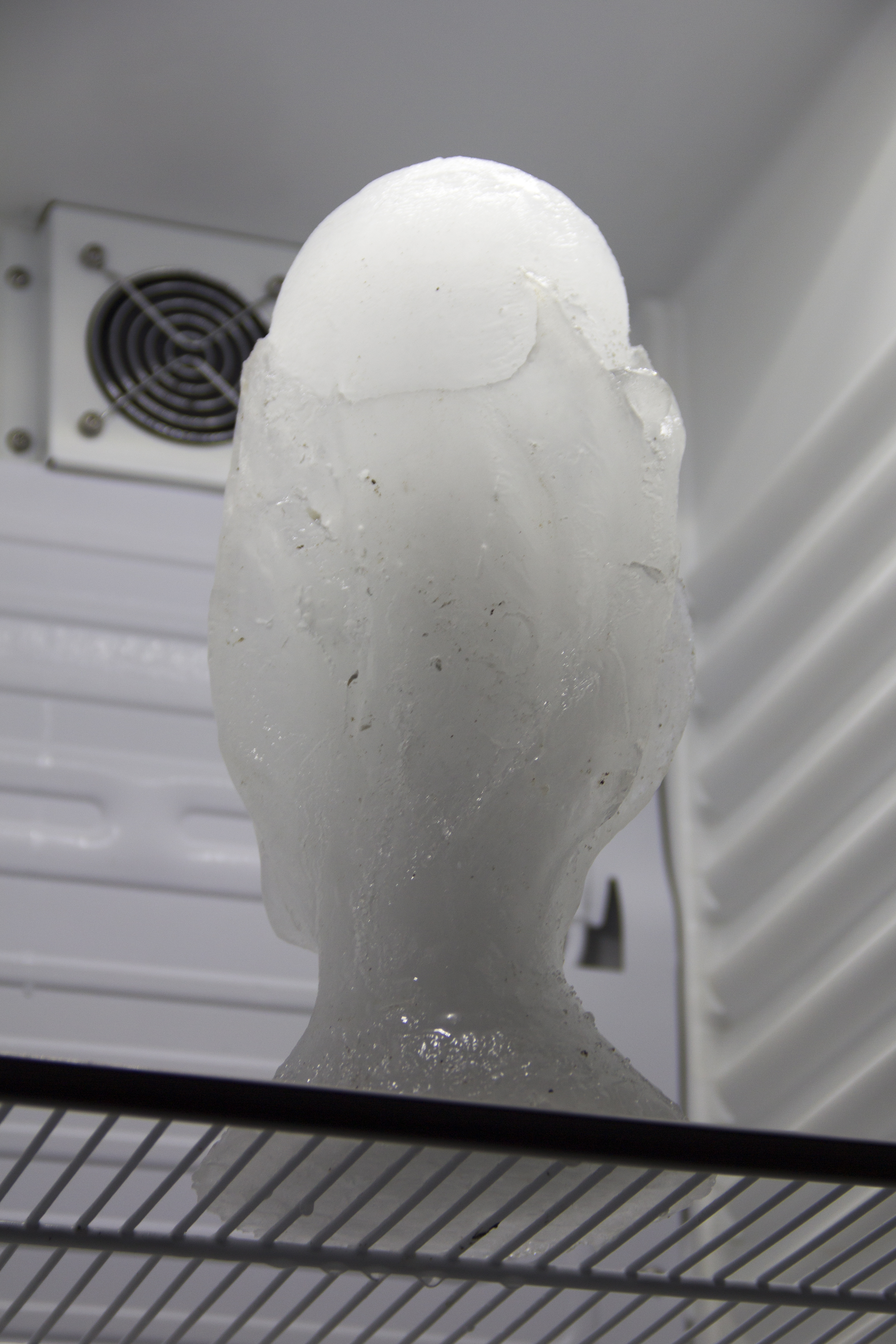
Frozen World Cup, 2020
Installation
Mini fridge, ice sculpture, video projection, sound system
Installation
Mini fridge, ice sculpture, video projection, sound system
Last but not least: my 4th project focused on Apple's packaging design as seductive mechanism and marketing strategy. For the show, I presented a series of assemblages of Apple boxes customized with extravagant and eccentric accessories, costumes, children toys and flashy puppets, in an attempt to ridicule Apple's zen-like minimalistic aesthetic. But it didn’t work, as these customizations in fact glamorized and made Apple products even more desirable objects to possess. Thus, contrary to my intentions, my assemblages weren't criticizing the tech giant but, instead promoted it, free of advertisement! This, in turn, made me realize the dangers—and traps—of the pastiche art, as a tool to denounce social and economic injustices.
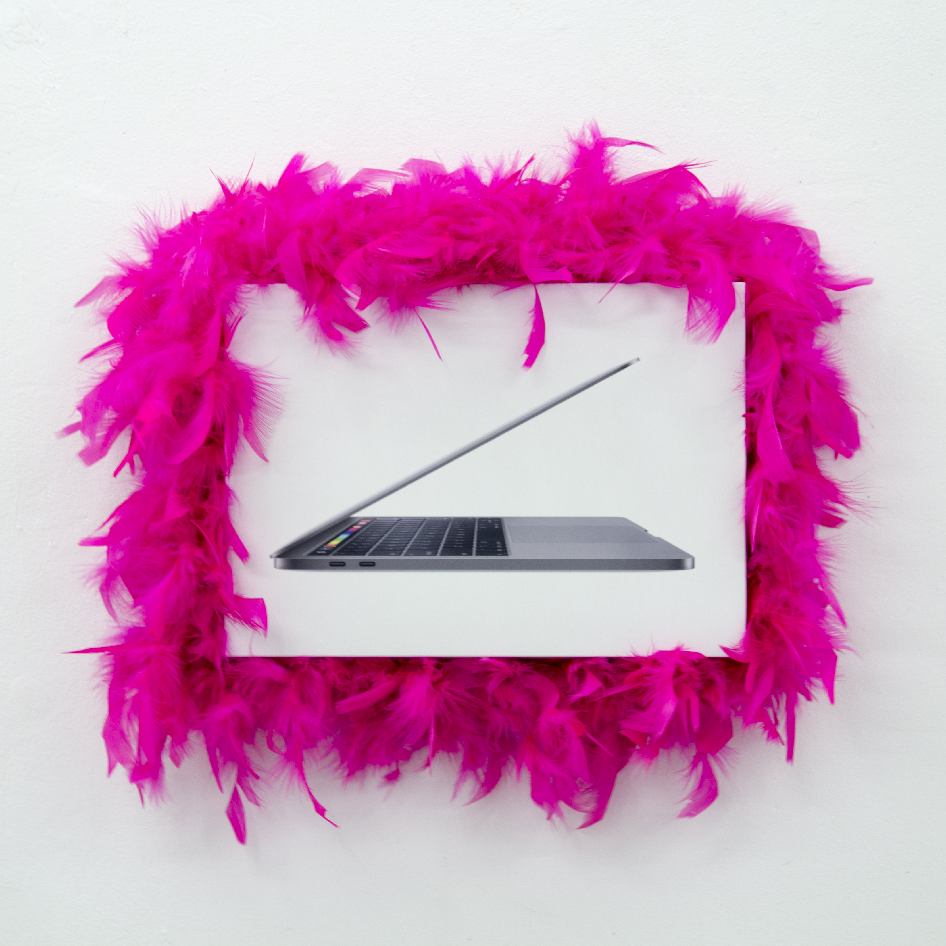
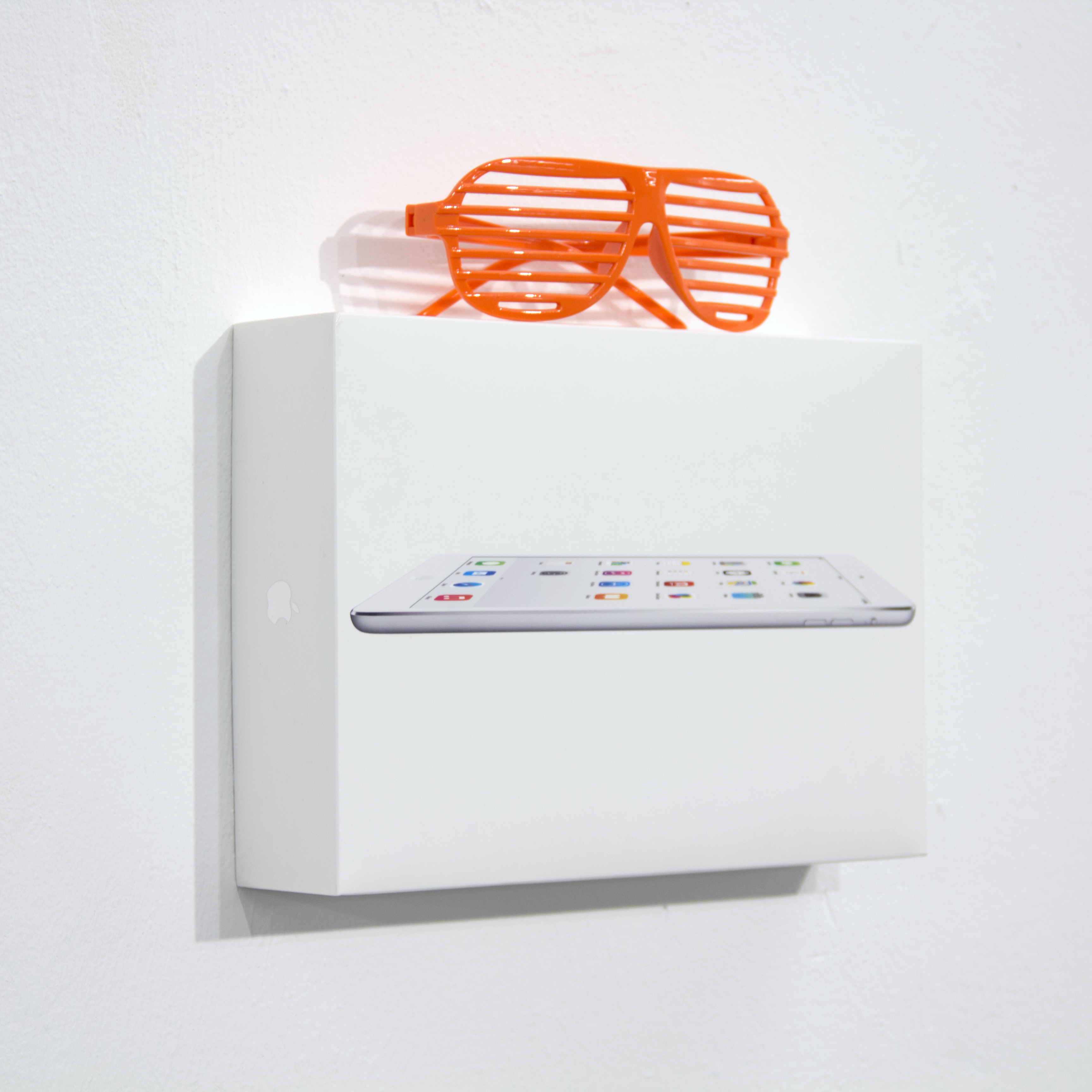
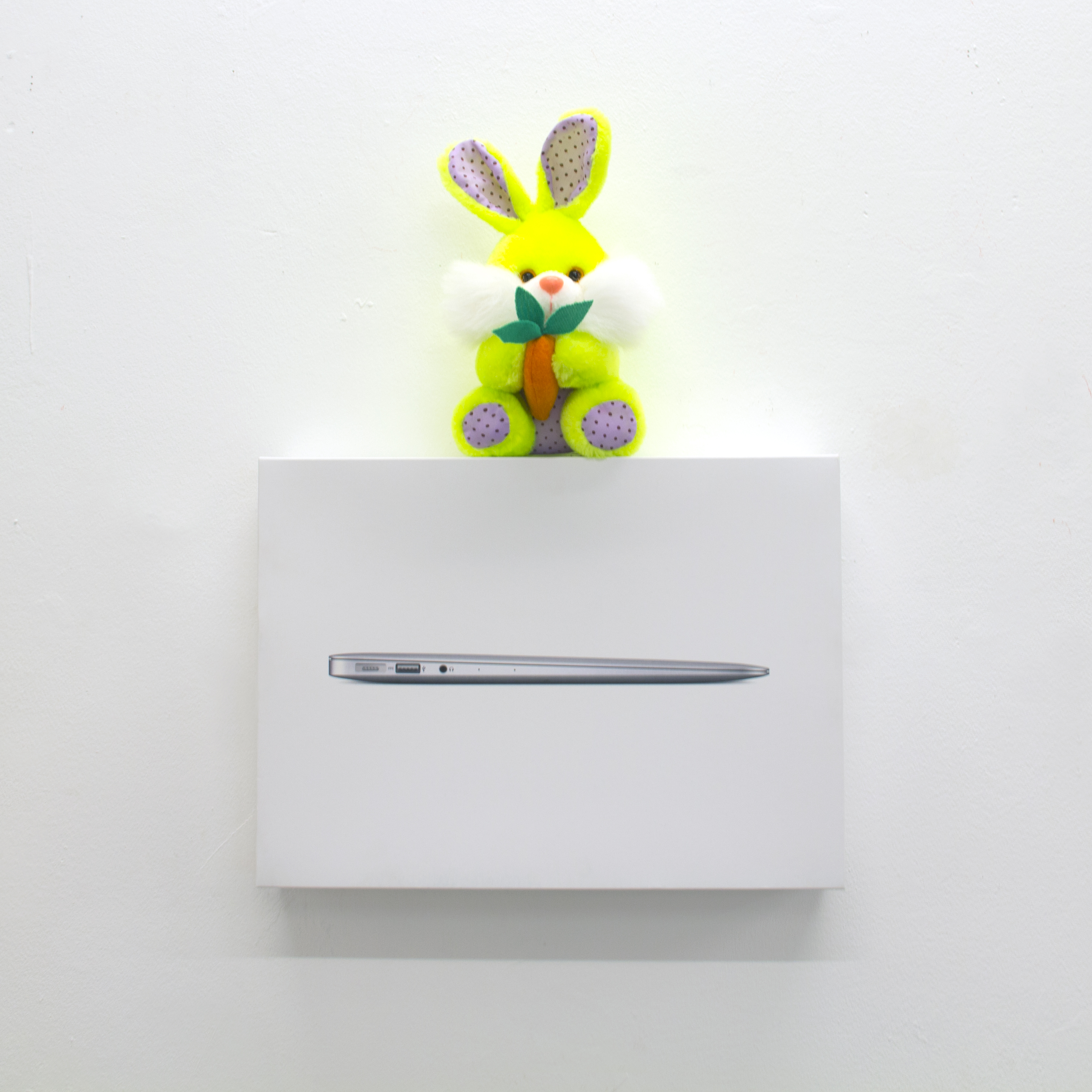

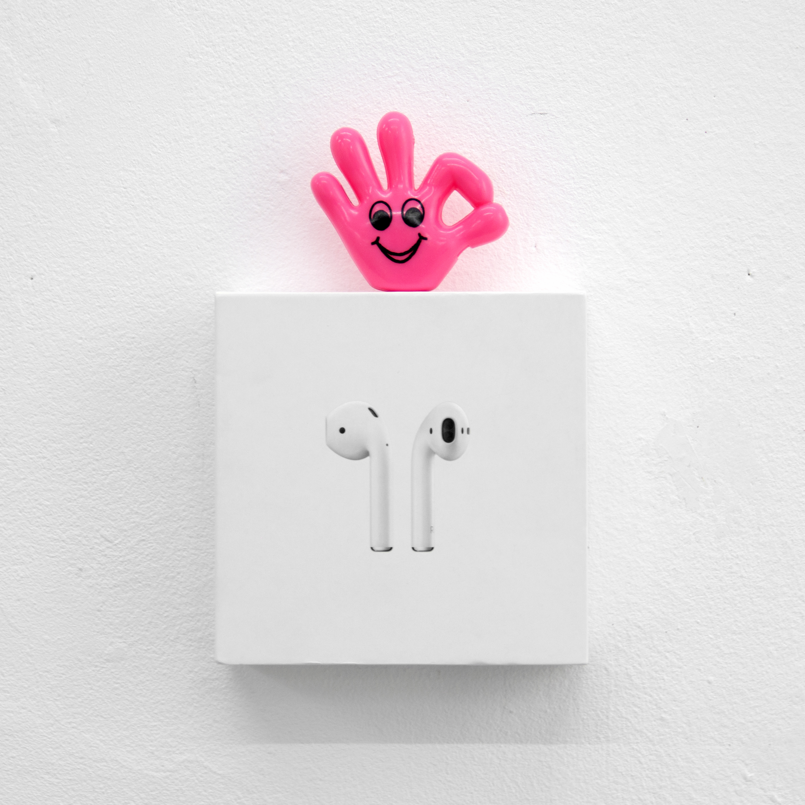
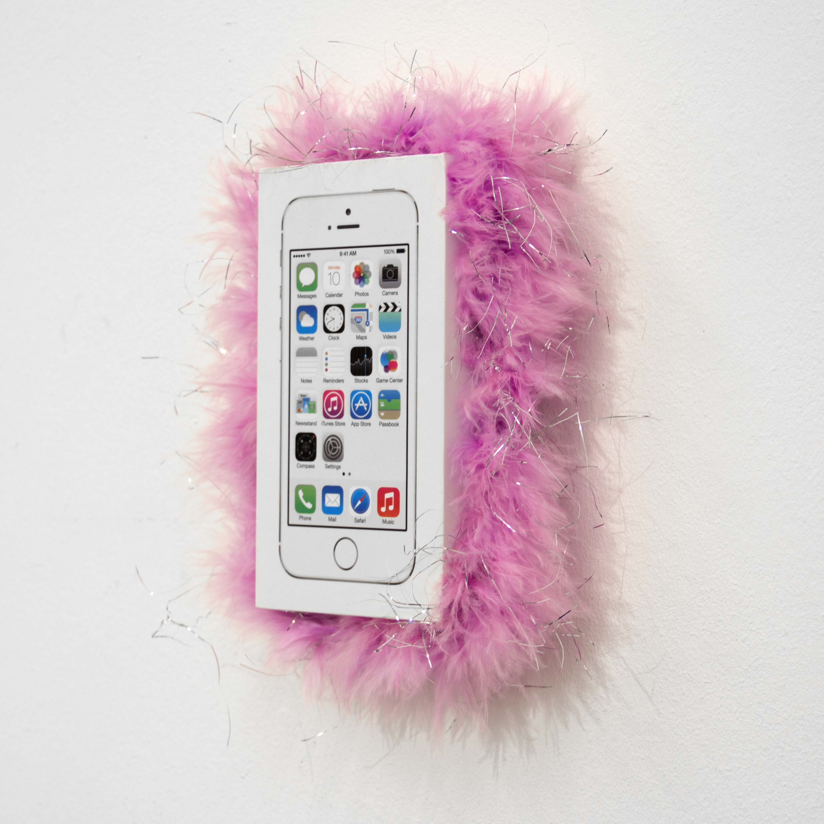
Queer Packagings, 2020
Assemblages
Full disclosure, I was very much inspired by David Attwood's work "The indebted Man"[1], which shows Nike shoes on top of iPhone4 boxes. I interpreted the combination as a subtle way to shed light on the complicity between the two multinationals: after years serving as a member of the Nike board of directors, Apple CEO, Tim Cook, was promoted to lead independent director in 2016. So yeah, it seems like in contemporary art, appropriating Apple products as ready-made artworks is OK, as long as it evokes and shows underlying truths and facts that we maybe don't know, especially unfair socio-political and economic issues Apple is involved in: the tech giant enjoys low fiscality in EU countries, poor labor rights in DRC—for cobalt mine extractions— and in Chinese FOX CONN factories, ...
Moreover, I had always thought of capturing the almost-sacrosanct dimension of high-tech products in our lives, and Apple’s success and mania was the perfect subject. A few months after I got back from Beirut, I decided to infiltrate Brussels' Apple Store by wearing a vendor uniform and distribute the round, altar bread-like, Apple candy to customers. But because of the current global pandemic, this project was put on hold. But I still did talk about the project during the jury and came up with a sort of Apple triptych that presented edible Apple sweets next to a poster advertising a fake new Apple product on a pedestal, as well as a white iPhone box, covered with stickers.
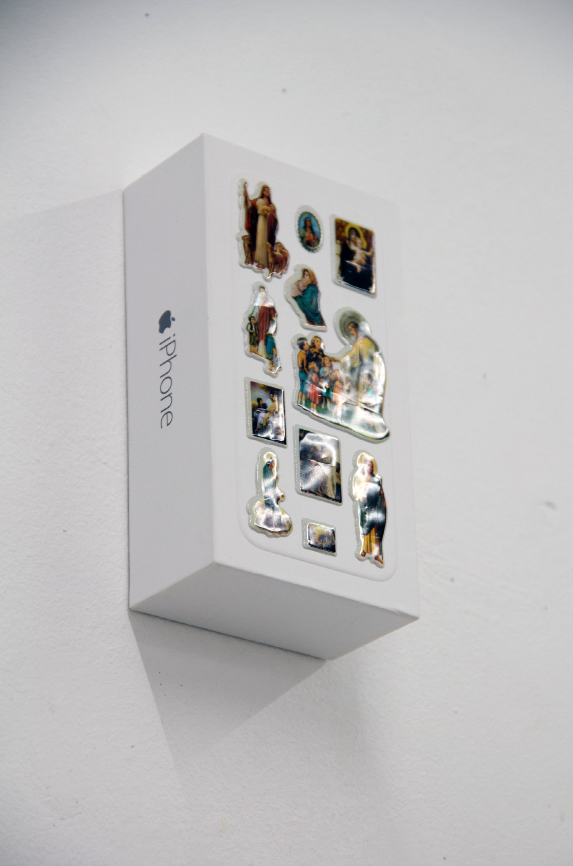
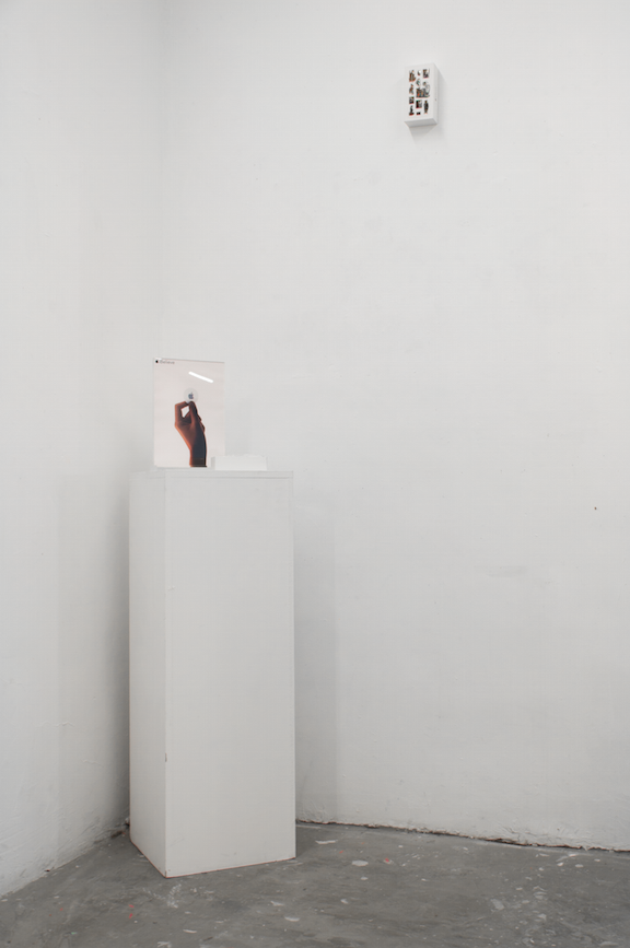

iBelieve, 2020
Installation
In chapter 7 of his book Brand Sense[2], Martin Lindstrom evokes Apple’s part in this holistic branding realm by stating that ‘at the core of Apple brand is a philosophy that guides its users which is far deeper than its stylish technology (Lindstrom:179). According to the author we, consumers, are looking for both emotional fulfillment and connection/bonding. And ‘Holistic Selling Proposition’ brands like Apple tend to accomplish this in several ways. Packaging is one of them: ‘by the means of tactile feelings of the product, its packaging . . . can provide a pharmaceutical company with a whole new geography for bonding with their consumers (Lindstrom:197).
______________________
1. http://www.davidattwood.net/index.php/selected-works/the-making-of-the-indebted-man/
2. Lindstrom, Martin, Brand Sense, Build Powerful Brands through Touch, Taste, Smell, Sight and Sound, Free Press, 2005.